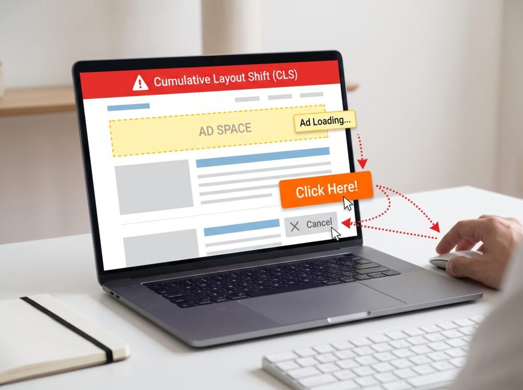
Have you ever opened a website, started reading a paragraph, and suddenly watched the text move because an image, advertisement, or banner appeared above it? That unexpected movement is called Cumulative Layout Shift (CLS). It can make a website frustrating to use, cause users to click the wrong buttons, and interrupt reading or shopping.
CLS is one of Google’s Core Web Vitals, which help evaluate real-world page experience. To fix it, you need to identify which elements move unexpectedly and why. Common causes include images without reserved dimensions, advertisements that change container size, web fonts that alter text layout, and dynamically inserted content.
Google recommends a CLS score of 0.1 or less for a good user experience, measured at the 75th percentile of page visits and evaluated separately for mobile and desktop. The goal is not simply to make a page load quickly; it is to keep its layout visually stable as content appears.
This guide explains how to diagnose layout shifts, fix the most common causes, and verify improvements using practical tools.
What Is Cumulative Layout Shift (CLS)?
Cumulative Layout Shift measures unexpected movement of visible page elements during a page’s lifetime. For example, if a product image loads without a reserved space, the product description and purchase button may move down after the image appears.
CLS is a user-experience metric rather than a direct measurement of loading time. A page can load its main content quickly and still have a poor CLS score if elements move unexpectedly.
Google calculates a layout shift score using two main components:
- Impact fraction: The proportion of the viewport affected by the unstable elements.
- Distance fraction: How far those elements move relative to the viewport.
The layout shift score combines these components. CLS then considers layout shifts within a session window, rather than simply adding every shift across an entire visit.
According to Google’s Cumulative Layout Shift documentation, the metric uses the largest qualifying session window, with a maximum duration of five seconds and gaps of less than one second between shifts.
What Is a Good CLS Score?
Google’s published Core Web Vitals thresholds are:
| CLS score | Assessment |
| 0.1 or less | Good |
| Above 0.1 and up to 0.25 | Needs improvement |
| Above 0.25 | Poor |
These thresholds are useful for prioritizing fixes, but they do not identify the cause of a problem. You still need to inspect the page and determine which elements are shifting.
Why Does Website Layout Shift Happen?
Several common implementation problems can cause layout instability.
1. Images and Videos Without Dimensions
When a browser encounters an image, it needs to know how much space to reserve for it. If an image has no dimensions or other reliable size information, the browser may initially render the surrounding content without accounting for the image’s final height.
When the image loads, the page expands and pushes nearby content down.
The same issue can occur with embedded videos, iframe content, and other media.
2. Advertisements and Embedded Content
Advertisements often have variable dimensions. If an ad container starts at zero height and expands when an advertisement arrives, content below it shifts.
Third-party embeds, social media widgets, and recommendation panels can create similar problems when their final dimensions are not reserved in advance.
3. Web Fonts Loading Late
A website may initially display fallback text and replace it with a custom web font after downloading the font file. If the new font has different character widths, line heights, or other metrics, text can wrap differently and move nearby elements.
This is especially noticeable in headlines, navigation menus, buttons, and large introductory text.
4. Content Inserted Above Existing Content
Cookie notices, promotional banners, consent messages, and dynamically loaded recommendations can push existing content downward when inserted into the normal document flow.
The issue is not necessarily that dynamic content exists. It is that the page changes its layout without accounting for the new content.
Let’s Figure It Out.
Tell us what you’re working on and we’ll help you identify the right next step.
Talk to an ExpertHow to Fix Cumulative Layout Shift Step by Step
Step 1: Identify the Source of the Shift
Before changing CSS or JavaScript, establish which elements move and when.
Use these tools:
- PageSpeed Insights to inspect field data when available and analyze a page under laboratory conditions.
- Chrome DevTools Performance panel to record loading behavior and investigate layout-shift events.
- Chrome DevTools Rendering tools to enable layout-shift visualization where supported.
- Search Console Core Web Vitals report to review grouped page performance data when sufficient field data is available.
Start with a page that has a poor CLS assessment. Record the page under realistic loading conditions, including a throttled network if appropriate. Look for content that moves after images, fonts, advertisements, or asynchronous requests finish loading.
Do not assume that the element causing the movement is always the element that visibly changes. An image can trigger a shift in the paragraph or button below it.
Step 2: Add Image Dimensions
The most reliable first fix for ordinary content images is to declare their intrinsic dimensions.
Instead of:
<img src=”/images/product.jpg” alt=”Product”>
Use:
<img
src=”/images/product.jpg”
alt=”Product”
width=”1200″
height=”800″
>
The browser can use the width and height attributes to calculate the image’s aspect ratio and reserve the appropriate space before the file loads.
If the image needs to adapt to different screen sizes, use CSS:
img {
max-width: 100%;
height: auto;
}
This allows the image to scale within its container while preserving its proportions.
For responsive images, make sure the declared dimensions reflect the image’s actual intrinsic ratio. For art-directed images that use different crops, account for the intended aspect ratio at each relevant breakpoint.
For more details, see Optimize CLS.
Step 3: Reserve Space for Ads and Embeds
Advertisement containers should have a planned size before the ad request finishes.
For example:
.ad-container {
min-height: 250px;
width: 100%;
}
Use a height appropriate for the actual ad format and responsive layout. A fixed minimum height that does not match the expected content can leave unnecessary gaps, so select dimensions based on the available ad inventory.
For embedded video content, reserve space using an aspect ratio:
.video-container {
width: 100%;
aspect-ratio: 16 / 9;
}
.video-container iframe {
width: 100%;
height: 100%;
border: 0;
}
This works when the iframe fills the reserved container. Avoid inserting third-party content into an empty, zero-height container that expands later.
Step 4: Reduce Font-Related Layout Shifts
Use appropriate font-loading strategies and select fallback fonts that resemble the final font in their layout metrics.
For example:
@font-face {
font-family: “SiteFont”;
src: url(“/fonts/site-font.woff2”) format(“woff2”);
font-display: swap;
}
The font-display: swap setting allows fallback text to appear while the custom font loads. It can improve text availability, but it does not automatically eliminate layout shifts.
Where appropriate, preload a critical font that is needed immediately above the fold, and avoid preloading fonts that are not essential to initial rendering.
You can also investigate CSS font metric adjustments, including size-adjust, ascent-override, and descent-override, to make a fallback font more closely match the final font. Test the result carefully because incorrect metrics can introduce clipping or other typography problems.
Step 5: Handle Dynamically Loaded Content
If a notification, product recommendation, or promotional banner must appear, decide how it should affect the page before inserting it.
Possible approaches include:
- Reserving space for content that will appear later.
- Rendering the content in an overlay when that behavior is appropriate.
- Showing a placeholder with dimensions matching the final component.
- Avoiding insertion above content the user is already reading.
Overlays are not always the right solution. A fixed banner can cover buttons or text, especially on small screens. Ensure that important content remains accessible and that dismissible notices do not obstruct essential actions.
Step 6: Avoid Layout Changes Caused by JavaScript
JavaScript can trigger CLS when it adds elements, changes dimensions, or updates content in a way that moves visible items.
For example, expanding an initially empty container after fetching data may shift the entire page. If the content size is predictable, reserve space before the request completes. If it is not predictable, consider a stable loading state or a layout that accommodates the result without pushing existing content unexpectedly.
When animations are involved, prefer properties such as transform and opacity where appropriate rather than animating layout-affecting properties such as top, height, or margin. This can reduce layout work, although it does not guarantee that every animation will be free of visual instability.
Do not remove useful content merely to improve a metric. Preserve the page’s functionality while making its layout predictable.
How to Measure CLS After Making Fixes
Understand Lab Data and Real-User Data
A Lighthouse or PageSpeed Insights test provides diagnostic information about a page under a particular set of testing conditions. Real-user field data, when available, reflects actual visits across different devices, network conditions, and interactions.
These measurements can differ. For example, an advertisement might load slowly on a visitor’s mobile connection but load immediately during a desktop test.
Use PageSpeed Insights to investigate problems, then monitor field data to determine whether the improvements benefit actual visitors. Google’s Core Web Vitals documentation explains how these metrics contribute to evaluating page experience.
Check Mobile and Desktop Separately
A page may have good CLS on desktop but poor CLS on mobile because its layout changes at smaller breakpoints. A navigation menu might wrap, an image might use a different aspect ratio, or a promotional banner might occupy substantially more vertical space.
Test the page at multiple viewport widths, including the widths your visitors commonly use. Pay particular attention to headers, hero sections, product grids, cookie notices, and sticky elements.
Also test interactions such as opening menus, applying product filters, and expanding accordions. Although not every movement caused by a user interaction contributes to CLS, these tests can reveal layout problems that affect usability.
Does CLS Affect Google Rankings?
CLS is one of Google’s Core Web Vitals, alongside Largest Contentful Paint (LCP) and Interaction to Next Paint (INP). Google recommends achieving good scores for these metrics to support a positive page experience.
However, improving CLS does not guarantee higher rankings. Google uses multiple signals when ranking search results, and a good Core Web Vitals score does not guarantee a top position. CLS optimization should be treated as part of a broader strategy that includes useful content, technical SEO, accessibility, and a well-functioning website.
For websites built with React, unexpected component changes can sometimes contribute to layout instability. Investigating rendering behavior alongside page measurements can help identify the underlying cause. See [INTERNAL LINK: Why Does My React Component Render Twice? Understanding Strict Mode and Fixing Side Effects] for more information about React rendering and effects.
Conclusion
Fixing Cumulative Layout Shift starts with finding the elements that move unexpectedly and understanding what triggers those movements. Set image dimensions, reserve space for advertisements and embedded content, optimize font loading, and design dynamic components so that they do not unexpectedly push existing content around.
After implementing each change, retest the affected pages with Chrome DevTools and PageSpeed Insights. Then review real-user data when it becomes available, paying attention to mobile and desktop performance separately.
Aim for a CLS score of 0.1 or less at the 75th percentile of page visits. More importantly, make visual stability part of your development process so visitors can read, navigate, and interact with your website without unexpected interruptions.
Frequently Asked Questions (FAQs)
1. How do I fix a poor CLS score in Google PageSpeed Insights?
Start by identifying the elements responsible for the largest layout shifts using Chrome DevTools. Add dimensions to images, reserve space for advertisements and embeds, optimize font loading, and prevent dynamically inserted content from unexpectedly moving existing elements. Retest the page after each major change and monitor field data when available.
2. What is a good Cumulative Layout Shift score?
A CLS score of 0.1 or less is considered good. A score above 0.1 and up to 0.25 needs improvement, while a score above 0.25 is poor. Google recommends evaluating the 75th percentile of page visits, with mobile and desktop results considered separately.
3. Can images without width and height attributes cause CLS?
Yes. When the browser cannot determine an image’s dimensions or aspect ratio before it loads, surrounding content may move when the image appears. Adding accurate width and height attributes allows the browser to reserve the required space. Responsive CSS can then scale the image without distorting its proportions.
4. Why is my CLS score good in Lighthouse but poor in Search Console?
Lighthouse measures performance under controlled testing conditions, while Search Console reports field data based on real-user experiences when sufficient data is available. Differences in devices, network speeds, advertisements, fonts, and user interactions can produce different results. Investigate both measurements instead of relying on a single test.
5. Does lazy loading images cause Cumulative Layout Shift?
Lazy loading does not inherently cause CLS. The problem occurs when an image loads without sufficient space being reserved for it. Specify image dimensions or an appropriate aspect ratio even when using loading=”lazy”. Avoid lazy-loading the main above-the-fold image when doing so would unnecessarily delay its discovery and loading.
6. How long does it take for Google to recognize CLS improvements?
Laboratory tools can reflect code changes as soon as you retest the updated page. Real-user field data takes longer to reflect improvements because it depends on visits collected over time. Google uses a rolling 28-day collection period for the Chrome User Experience Report, so field assessments may not change immediately after deployment.
Let’s Talk About Your Business
Not sure which approach is right for your business? Get a free consultation with our team.
Get Free Consultation